(*Linked or embedded content may have been removed or be unavailable.)
They say beauty is in the eye of the beholder, but in the case of Western eyes beholding Japanese websites, the beauty is hard to find. Japanese websites often feature loud banners, dense text, multiple columns, lots of tiny images and an overall cluttered, crowded look. But why? Understanding the reasons why Japanese UX (user experience) is this way will give you a leg up when localizing your site for a Japanese audience, or perhaps building it from the ground up.
For the sake of transparency, let me come clean and admit that for this post I borrow heavily from the article “The truth about Japanese web design” that I wrote for MultiLingual Magazine back in 2018. The only reason that’s possible is because many of the underlying factors behind Japanese UX haven’t changed one bit since then. But rest assured, content for this post has been updated appropriately.
Contents
- 1 Let’s compare and see the difference
- 2 Language plays a key role in the “look” of Japanese UX
- 3 Same color, different meanings
- 4 The clutter isn’t a problem, it’s a given
- 5 What consumers are looking for is different
- 6 Just like window shopping
- 7 The minimal impact of minimal design in Japan
- 8 Remember, zen is for monks, not merchants
Let’s compare and see the difference
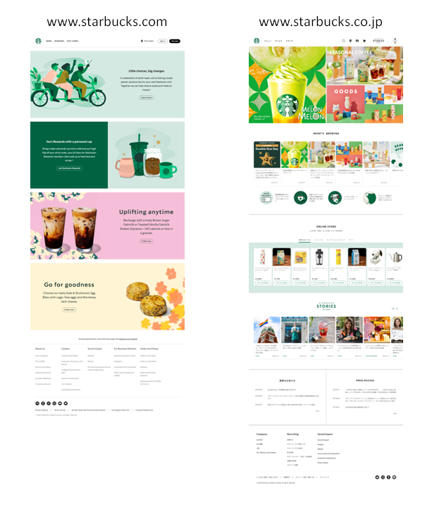
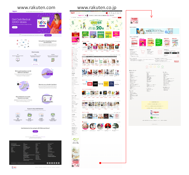
To give you an idea of the Japanese versus Western differences in UX, let’s look at both the English and Japanese sites for Starbucks and Rakuten to see how a foreign entity successfully localizes for the Japanese market, and how a Japanese entity localizes for the global market.
Despite some tough competition, Starbucks is the most popular café chain in Japan with 1,727 shops nationwide (followed by Doutor with 1,067, Komeda with 950, and Tully’s with 760). Whereas their .com site follows the basic rule of “one block, one message,” the .co.jp site is more content-heavy, featuring lots more (and smaller) items throughout the page. This is basically the same on both their PC and mobile sites – not that the Japanese site has been localized haphazardly, but rather because this look is spot-on for Japanese customers. Across many industries, the Japan-specific websites of global brands tend to be more packed full of content than their corresponding global sites. And the Japanese audience eats it up.
Rakuten is Japan’s leading homegrown ecommerce site, and a competitor of Amazon. If you compare their domestic Japanese site to their global English site, you will notice an entirely different UX. The English site features a clean look with sparse text and ample negative space, again following the best practice of “one block, one message.” But the Japanese site couldn’t be more different. You get everything but the kitchen sink (or maybe that too) on a single page, making it twice as long as the global English page. And whereas the blocks are basically horizontally oriented on the .com site, the co.jp site features the long banner column extending down the length of the page, which is a common sight on Japanese sites.
A Western UX designer may look at this and think it’s crazy, but in fact it’s a growing trend in Japan to have more on a single page. Consumer research has shown that Japanese consumers prefer to scroll to access additional information over clicking or tapping to access another page. Some sites leverage modern front-end development SDKs like Angular and React to simplify same-page navigation by linking to different sections within the page instead of to a separate page.
Now let’s break down the various factors that lead to the look of Japanese UX.
Language plays a key role in the “look” of Japanese UX
The Japanese language uses four different scripts — the syllabic hiragana and katakana, the logographic kanji and the alphanumeric character set — possibly within the same block of text or even within the same sentence. What’s more, hiragana, katakana and kanji can be laid out horizontally or vertically (such as in banners). These characteristics contribute to an overall chaotic impression for Westerners, but for Japanese people it’s only natural. So even just in terms of language — an obvious element in website design — we already see a world of difference between Japan and the West.
Same color, different meanings
Looking at any Japanese website, you may be struck by their use (or perhaps overuse) of color, especially the use of red. The color red universally evokes “danger” and “urgency,” but in China it also symbolizes “luck,” in India it’s associated with “purity,” and in Eastern Europe it still strongly links to “communism.” And Japan? Red has roots dating back to ancient times, whether it’s the red of a Shinto shrine’s torii gate or the red battle standards used by the Taira clan against the Minamoto (like the Lancasters vs. the House of York). In today’s battle over customers, red is commonly used to grab attention on a web page.
When localizing for any foreign market, it’s important to keep in mind that colors take on different meanings in different cultures. Take for instance the color purple. As David McCandless describes in his book “Information is Beautiful,” this color is associated with “flamboyance,” “modesty,” “personal power,” and “virtue” in many Western cultures, but in Japan it’s associated with “insight,” “wisdom,” “celebration,” and “divinity.” So remember to do your research and make sure your color scheme won’t be sending the wrong message to your target audience.
The clutter isn’t a problem, it’s a given
Japanese UX didn’t develop in a vacuum — there’s historical and cultural context. For example, that cluttered look isn’t something unique to websites; take the fliers that come with the morning paper. They’re called chirashi and Japanese consumers regularly rely on them to find the best buys in town.
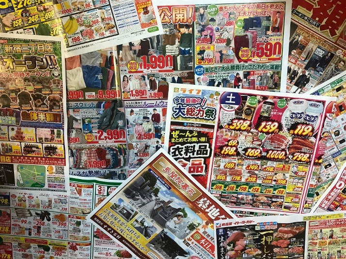
Back in 2005, when Walmart acquired a majority interest in Japanese supermarket chain Seiyu, they moved to discontinue the chirashi, assuming they were wasteful and archaic. But after major push-back from local marketing staff, they reconsidered and reversed their decision before taking 100% ownership in 2008. Now, not only does Seiyu continue to send out their chirashi, it’s even distributed through online chirashi sites like Shufoo! and Tokubai. This allows younger consumers who don’t have newspaper subscriptions to browse through chirashi right on their smartphones. The Japanese consumer’s eye is well trained to scroll through copious amounts of visual information to find what they need.
What consumers are looking for is different
As Japanese people tend to require more information before reaching a purchasing decision, it’s standard practice for Japanese companies operating globally to create one text-heavy version (web page, brochure, anything) for the Japanese domestic market, and another “rest of the world” version that gets localized into multiple languages for markets worldwide. Often the Japanese domestic version goes into a lot more technical and product detail because that reflects the culture’s buying process. The non-Japan version focuses more on user benefits, perhaps not even mentioning the specific technology that makes those benefits possible. Because in the West, consumers are focused on how a product is going to make them feel or better their lives; the end result is more important than the how. This contrasts with Japan, where specifications play an important role in selling the experience. Consumers don’t need to truly understand the tech (actually that’s a steep hurdle), they just need to think that they understand it, and Japanese sites try their best to provide that environment.
Just like window shopping
Getting someone to click on your website is a challenge. Western websites commonly offer only minimal information on the homepage, thereby compelling visitors to click for more information. Asking visitors to click is essentially the same as asking them to commit to a process, which some Japanese consumers can shy away from. Many successful Japanese websites take the approach of showing visitors what they need up front. As a tactic, this is just like the food replicas you’ll find in restaurant window cases throughout Japan.
Before committing themselves to walking into a restaurant, Japanese customers get a really good idea of what the cuisine there looks like thanks to 食品サンプル (shokuhin sanpuru; food samples). These taste-bud-arousing replicas are expertly made of plastic and wax, so the food is able to defy the laws of gravity and fluid dynamics in those showcases. Their purpose is to inform and reassure — which is what those cluttered Japanese websites do, too.
A different kind of example highlighting the Japanese unwillingness to commit without knowing the details was offered by Tim Romero, entrepreneur and host of the Disrupting Japan podcast, who led the Japan market entry for a San Francisco startup. “We had this sign-up wizard, where it would walk you through every step of the sign-up, and it was about six pages long that everyone around the world really liked. But, we also had this kind of diagnostic tool, which was a single page with probably 60 different fields you had to input. It looked horrible. We found that the Japanese actually preferred the single page to the well-designed, hand-holding wizard. I think it was just a sense that the Japanese like to know what they’re getting into before they commit to a process.” (Podcast 050: Localization in Japan) Keep in mind, what looks appalling to you might be appealing to the Japanese consumer.
The minimal impact of minimal design in Japan
When you look at the Wikipedia entry for Minimalism, there’s a whole section on “Influences from Japanese tradition” that talks about the aesthetic principles of Ma (間; negative space) and Wabi-sabi (侘び寂び). So it’s all the more ironic that minimal design is not a more dominant force in Japanese UX.
Fact of the matter is, Japanese customers may be impressed at first sight by the aesthetic beauty of a minimally designed website, but if the information they want is not available soon after, they will become suspicious of the company’s capabilities and leave. So, information cannot be too hidden. The “one block, one message” style of UX simply does not cut it in Japan.
A major exception to this rule is in luxury brands and cosmetics, since their message leans heavily towards image-building instead of item-selling. Japanese cosmetics brand POLA adopted a minimal design for their corporate website in 2017, breaking from their previously cluttered UX. Global brands like Dior, Chanel, and Gucci all have websites with a universal design that’s shared across markets, including Japan. In such cases, the brand image continuity and air of credibility that comes with a Japanese site that’s the same as the “home” version except for language, affords advantages that far outweigh any downside.
Some new startups and smaller companies seem to be adopting a simplified, more Western-style look for their websites, though. Part of this is because those companies are less constrained by traditional thinking, and may be driven by young minds that like the minimalist look with bold images and less text. But one should also consider another factor behind this, and that’s the advent of template-based website builder platforms such as Wix, Shopify, Squarespace, SITE123 and the like. By using them, companies “sacrifice” the usual UX norms for Japan in exchange for a sleek look as well as a significant cost reduction to launch and maintain their website. As they say, necessity is the mother of invention. And for some companies, the cost factor is that necessity.
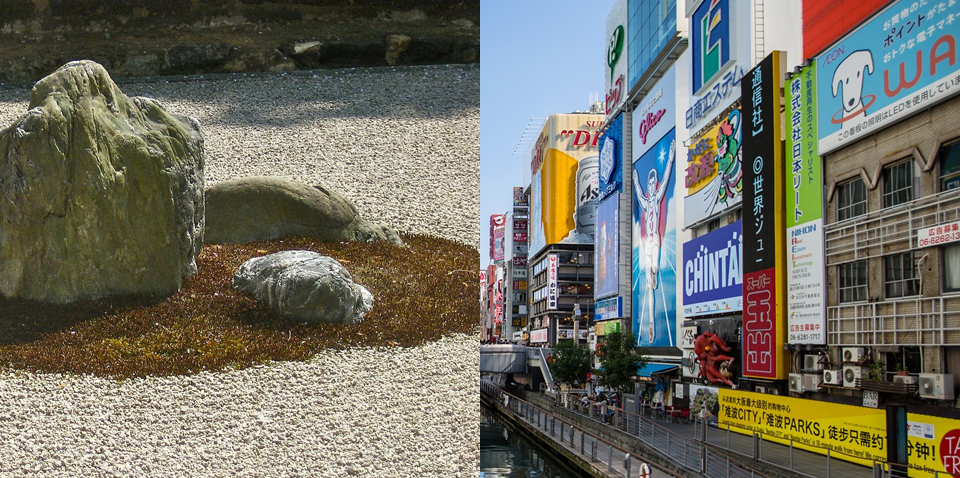
Remember, zen is for monks, not merchants
The name “Japan” may conjure up images of serene rock gardens, zen temples, and tea ceremonies. This traditional Kyoto-esque image of Japan is just one side of what Japan is all about. The other side is like Osaka, a short 60km ride from Kyoto, offering a stark contrast as a merchant city with nothing subtle about it. So if you ever catch yourself assuming that a minimalistic zen-like design is something that a Japanese audience would naturally be comfortable with, think again. If you aim to do more than project your brand image and actually hope to sell something, remember that today’s Japanese UX environment can be thought of more as a descendant of Osaka-style akinai (商い; trade, business) than Kyoto-style wabi-sabi.
When it comes time to develop your online presence for Japan, it’s important not to assume that great Western UX equals great Japanese UX. Japanese UX has deep roots in linguistics, culture and history. When you look at factors such as language, what Japanese people are used to seeing, and the way they seek information, it’s clear that Japanese consumer needs are different from Western ones. It’s not likely that just translating your site into Japanese will give you the level of success you’re counting on.
Douglass McGowan
P.S. Here’s the article from MultiLingual magazine: