
(*Linked or embedded content may have been removed or be unavailable.)
The smartphone is the primary touchpoint for a significant portion of users in Asia. For many users, the mobile interface is the first and only impression a brand makes. If the interface feels like an afterthought, users will treat it as a sign that the brand isn’t committed to their market.
That’s why it’s ironic that many market entry strategies still begin on a desktop. When a product team enters these markets with a desktop-first mindset, a cramped layout is often the least of their concerns.
Features are prioritized and layouts are polished on a large monitor before being adapted to fit a smartphone. The mobile version becomes a portable alternative and essentially, a condensed version of the desktop experience.
Getting the text right matters, but it’s only part of the job. What works on a Western mobile interface—minimal navigation, progressive disclosure, whitespace as a signal of quality—often feels different in Asian markets.
In this article, we’ll take a look at mobile UX design considerations for the CCJK (Chinese, Japanese, and Korean) markets. Adapting for those markets means understanding what users expect to see, how local scripts behave inside a mobile UI, and why those decisions belong earlier in the process than most product teams realize.
Contents
One screen, many markets
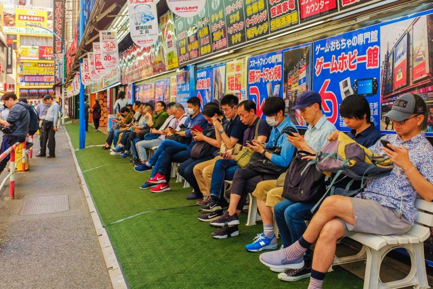
Japan gets the most attention in conversations about Asian UX, and for good reason. Japanese users want more information on screen than most Western design conventions allow for. Technical specifications, trust indicators, and supporting content belong upfront rather than tucked behind menus or secondary screens. As we covered in an earlier post on Japanese UX, a layout that looks cluttered to a Western designer is often doing exactly what it needs to do for a Japanese user.
In South Korea, Kakao and Naver are the dominant local platforms for messaging, search, and payments, and they shape how users expect a mobile product to behave. Interface conventions, navigation patterns, and payment flows that align with those platforms feel natural to South Korean users. Those that don’t signal that the product wasn’t really built for them.
China’s mobile landscape is defined by WeChat and Alipay in a way that has no real Western equivalent. WeChat is simultaneously a messaging app, a social platform, a payment system, and a storefront. Alipay handles a significant share of daily financial transactions across the country. For many users, these platforms are the internet. A mobile product that doesn’t take this into account is operating outside the context users actually live in.
Taiwan is often caught in the slipstream of Chinese localization planning, which creates a specific and avoidable problem. China uses Simplified Chinese while Taiwan uses Traditional Chinese, and local users notice the differences immediately. They are not variants of the same language for practical purposes, and treating them as such tends to show.
Hong Kong uses Traditional Chinese script, but the dominant spoken language is Cantonese rather than Mandarin. These languages are not really mutually intelligible, and that carries into word choice and character combinations in ways that a product built for Taiwan won’t automatically cover.
Text, typography, and layout
The most common assumption product teams make is that a localized build is essentially the same but with different text. In fact, the text changes everything around it.
Chinese strings typically run around 30% shorter than their English equivalents, which leaves unexpected space in containers designed around longer labels. Japanese mobile UX can run longer depending on context, and because Japanese uses three scripts—kanji, hiragana, and katakana—sometimes all within the same sentence, line breaks become unpredictable in limited spaces like navigation menus and tooltips. What looks like a translation issue is usually a layout issue that was present before the translator touched the file.
Meanwhile, Chinese, Korean, and Japanese don’t rely on italics or bold for emphasis the way Latin-based scripts do. Visual hierarchy is established through font weight, color, and background treatment. A UI that uses italics to signal importance or bold to draw attention to a call to action needs to be rethought for CCJK languages, not just retranslated.
Button labels are another challenge. A fixed-width button that works for Submit or Next in English often needs to be reworked for Japanese or Korean. A localized build has to be evaluated on its own terms, not measured against the source UI it came from.
Before you launch
Getting a product ready for Japan, South Korea, or China involves more than confirming mobile UI translations are correct. The interface needs to be evaluated by someone who speaks the language and can move through the product the way a local user would, instead of running automated tests against a checklist.
Localization testing for mobile apps starts by working on real devices. Screen sizes, input methods, and rendering behavior vary significantly across the Android handsets that dominate much of Asia. Things that look fine in a desktop browser or simulator have a way of behaving differently on actual hardware.
Payments work the same way. In Japan, Korea, and China, local platforms handle most purchases, and a checkout that doesn’t use them asks users to do something outside their normal behavior. Most won’t, which is a leading cause of cart abandonment and failure for applications to catch on.
The review also needs to account for how the localized interface actually reads. Terminology consistency, navigation labels that make sense in context, error messages that say something useful rather than a translated approximation. A bilingual reviewer moving through the product as a real user would catch these things. A translation check against a source file won’t.
Adding a localization review before finalizing the UI components gives the product team time to make those adjustments properly rather than working around a locked build.
Making real connections with mobile-first consumers
Asian consumers have high expectations about mobile utility. Each of these markets has spent years developing its own version of what a mobile product should be. By the time a product arrives, users already know what they’re comparing it to, and it’s not the English version.
These customers are looking for comprehensive utility and upfront proof in their mobile solutions. They expect to see technical specifications, trust indicators, and detailed supporting content that would usually be hidden behind a menu in a Western app.
In a mobile-first market, the interface is the primary evidence of your product’s quality. When the UI handles high information density and native payment flows correctly, it proves your technology is as sophisticated as the local apps being used every day. This level of polish ensures the user can focus on the product rather than the interface. By delivering a familiar experience from day one, you establish the credibility required to turn a first-time user into a long-term customer.
Crestec USA’s project managers can help you plan and execute the localization strategy for your digital presence and product launches in Japan and Asia. Consult with us on mobile-first design, and UX and UI localization for Asian markets.